
CSS Custom Properties for Theme Management
Organize all your theme colours using CSS variables. We’ll show you the structure that scales.

Learn how to design light and dark themes that feel intentional, not like an afterthought. We’ll walk you through specific techniques for maintaining brand consistency across both modes while respecting readability standards.
Dark mode isn’t just a trend anymore. It’s an expectation. Users want choice, and they want it to feel seamless. But here’s the thing—slapping a dark background on your existing design doesn’t cut it. You need a strategy.
We’re talking about creating two complete colour systems that work together. Your brand colours need to pop in both light and dark contexts. Your text needs to remain readable. Your accents need to guide users equally well whether they’re looking at your site at noon or midnight.
The challenge? Most designers treat dark mode as an afterthought. They invert colours, bump up some contrast, and call it done. That approach leaves you with inconsistent experiences and confused users.
Your primary brand colour is probably perfect for light mode. It’s vibrant, it pops, it says “this is us.” But that same colour? It might feel too intense or even hard to read against a dark background. You’re not changing your brand—you’re adapting it.
Here’s the approach that works: Take your primary colour and create two versions. In light mode, you might use your original vibrant colour for accents and interactive elements. In dark mode, you’ll likely need a lighter, less saturated version. Think of it like adjusting the volume, not switching the song entirely.
Let’s say your brand blue is #0066cc. That’s solid for light backgrounds. But on a dark background, it can feel harsh. A lighter blue like #4da6ff might feel more natural while still keeping that brand identity. The saturation stays consistent. The brand personality remains.


This is where a lot of designers slip up. They’ll create a gorgeous dark theme with subtle, sophisticated colours that look beautiful in isolation. Then users complain they can’t read anything. You need a 4.5:1 contrast ratio minimum for body text. That’s WCAG AA standard, and it’s the baseline for any serious project.
The challenge gets real when you’re working with both light and dark modes. A colour that works perfectly for contrast in light mode might fail in dark mode. You’ll need to test both. Every text colour against every background. Every interactive element against its context.
Tools like WebAIM’s contrast checker or Stark make this easier. But the real work is systematic testing across your entire design. Secondary text, links, buttons, form inputs—they all need attention. Dark mode shouldn’t mean dim and hard to read. It should mean intentional and accessible.
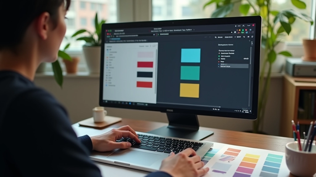
You don’t want to hardcode colours everywhere. That’s maintenance nightmare territory. CSS custom properties—or CSS variables—are how you scale this. You define your colour system once, and it updates everywhere at once.
Set up your variables in a logical way. Group them by purpose, not by colour. You want variables for text, backgrounds, borders, and interactive states. In light mode, your text might be nearly black. In dark mode, nearly white. The variable name stays the same. The value changes based on context.
Light mode variables:
–color-text-primary: #1a1a1a
–color-bg-primary: #ffffff
–color-accent: #0066cc
Dark mode variables:
–color-text-primary: #f5f5f5
–color-bg-primary: #1a1a1a
–color-accent: #4da6ff
The beauty here is that your actual components don’t change. A button always uses the same CSS: background-color: var(–color-accent). The button adapts automatically when you switch themes because the variable value changes.


Here’s what separates thoughtful designers from the rest: respecting what users actually want. The prefers-color-scheme media query lets you detect whether someone has dark or light mode enabled at the operating system level. Most users set this once and forget about it. You should honour that choice.
You can apply different variable values based on this preference. Light mode users get one set of colours. Dark mode users get another. But here’s the important part—give them a toggle anyway. Some users prefer their OS to be dark but want light websites. Others are the opposite. A simple toggle in your UI respects individual preference and builds trust.
Store the user’s choice in localStorage so it persists across sessions. If someone toggles to dark mode, they shouldn’t have to do it again on their next visit. That’s attention to detail. That’s what makes your site feel polished rather than like a generic template.
List every colour you currently use. Don’t just look at the main brand colours. Include text colours, borders, shadows, backgrounds, and interactive states. You’ll need counterparts for all of these in your dark theme.
Use a contrast checker for every text colour against every background. Create a matrix. Light text on dark background, dark text on light background. Secondary text, links, disabled states. Document what works and what doesn’t.
Define CSS variables organized by purpose. Use a consistent naming convention. Update your components to use variables instead of hardcoded colours. Test both modes to ensure everything works.
Build a theme switcher that respects system preferences but allows manual override. Store the choice. Make the transition smooth—no jarring flashes when switching modes. Your users will notice the care you’ve put in.
You can slap dark mode on your site in a weekend. Toggle the brightness, invert some colours, call it done. But that’s not what we’re talking about here. A proper dual colour scheme takes planning. It requires testing. It demands that you think about how your design works in two completely different contexts.
The payoff? Users feel respected. Your brand looks intentional in both light and dark. Accessibility standards are met across the board. And when someone toggles between modes on your site, it feels smooth and natural rather than like a hastily bolted-on feature.
Start small if you need to. Pick your primary text and background colours. Get those right. Then expand. Add accent colours, secondary text, interactive states. Use CSS variables to keep it maintainable. Test everything. Your dark mode doesn’t have to be complex—it just has to be thoughtful. That’s the difference between a design that works and a design that people actually enjoy using.

This article is provided for educational and informational purposes only. The techniques and approaches described are based on current web standards and accessibility guidelines. Specific implementation may vary depending on your project requirements, target audience, and business needs. Always test your colour schemes thoroughly with real users and accessibility tools. Web standards and browser support evolve continuously—we recommend staying updated with the latest WCAG guidelines and CSS specifications from the W3C.